
The accessibility pitfalls of truncating text
Posted:
Truncated text, where text is cut off with an ellipsis or fades away, is still something often seen on the web, especially within web applications. Usually as a way to prevent long text from wrapping or for visual consistancy. When text is truncated it can hide meaning, effect understanding and place extra effort on people who already face barriers when using the web.
In this post, I’ll look at why text is truncated, how it is usually done, the accessibility issues it causes, and what to do instead.
Why text is truncated
Designers and developers typically truncate text to:
- Preserve visual balance: even when it limits what users can read
- Control content of unknown length: such as content entered by users in a CMS or pulled from external systems
- Maintain fixed datatable layouts: where rows, columns, and cells stay a uniform size
- Optimising for different devices: by reducing visible text on smaller screens
How is text truncated
CSS (most common method)
Truncating text is typically done by CSS. Many design systems such as Bootstrap and Tailwind include classes that truncate text. Text truncated in CSS is typically done by setting a width or max-width on the element or container plus:
.truncate {
  overflow: hidden;
  text-overflow: ellipsis;
  white-space: nowrap;
}
Text can also be truncated after a set number of lines:
.multi-line-truncation {
  display: -webkit-box;
  -webkit-line-clamp: 3;
  -webkit-box-orient: vertical;
  overflow: hidden;
  max-width: 230px;
}
Because CSS truncation is purely visual, the full text still exists in the page. This becomes important later when looking at screen reader support.
JavaScript or server side truncation
Text truncation can also be handled with JavaScript or server side logic, where strings are cut short when they reach a certain length and ellipses appended, or worse text is truncated in the middle of the string - for example: "This text is [...] and ends here".
This approach should be avoided. It permanently removes content, meaning screen readers and other tools cannot access the full text. It also increases the risk of cutting words or sentences in confusing ways.
Who is affected
Truncated text can affect everyone, especially when meaning or context is lost. Some groups face extra barriers:
- People with vision impairments: who use higher levels of zoom, use larger font sizes or modify text through custom styles
- People with mobility impairments: who use voice control software to interact with content
- People with cognitive impairments: who benefit from seeing complete information
- People with language difficulties: who may need full words and sentences to read comfortably
- Keyboard-only or touch users: Sometimes, developers hide truncated text behind a hover event on the truncated text, which wouldn't be accessible to keyboards or people using touch devices
- Smaller screens: where truncation is triggered by responsive layouts or zoom
Issues caused by text truncation
Here is a simple CodePen with examples of single line truncation, multi line truncation, and a truncated button. The truncation is intentionally strong to make the issues easier to see.
See the Pen Truncating text by James Jacobs (@jamesjacobs) on CodePen.
Effects on text style modification
Many people change how text looks on their device. Some do this by choice, others out of need. These changes may be set in the browser, the operating system, or through third party tools.
Common changes include:
- Larger font size
- Increased line height
- More space between paragraphs, words or letters
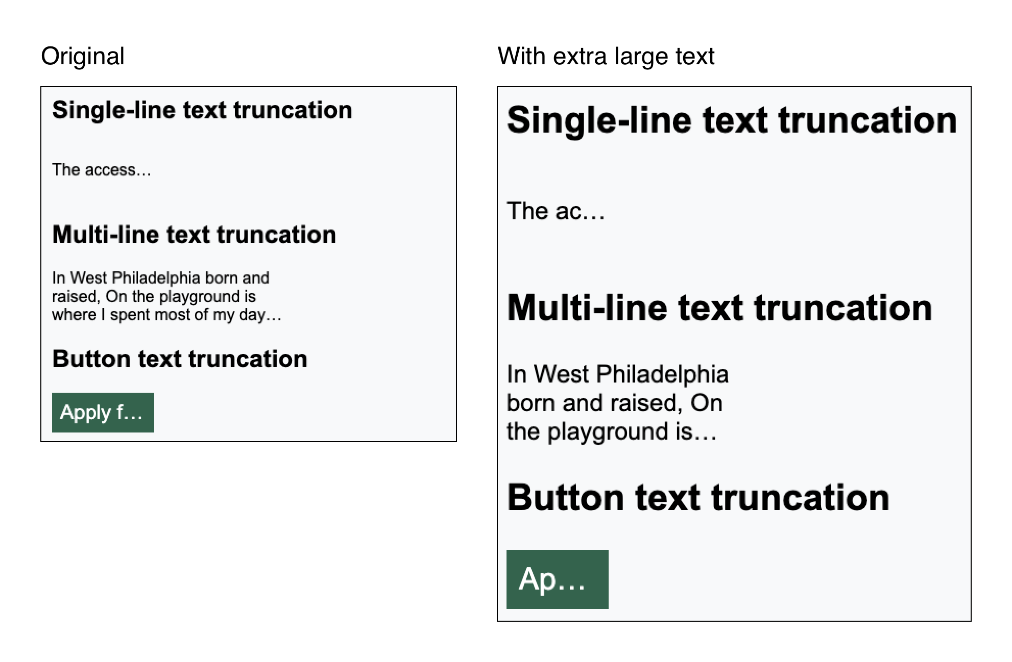
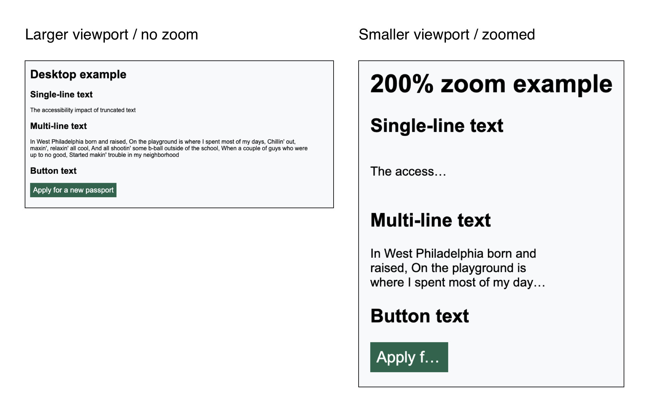
Increased font size
In the screenshot below, taking the CodePen example, I've increased the default text size in my browser to extra large. Due to the text size increase, more of the text is cut off, futher reducing readability and meaning.
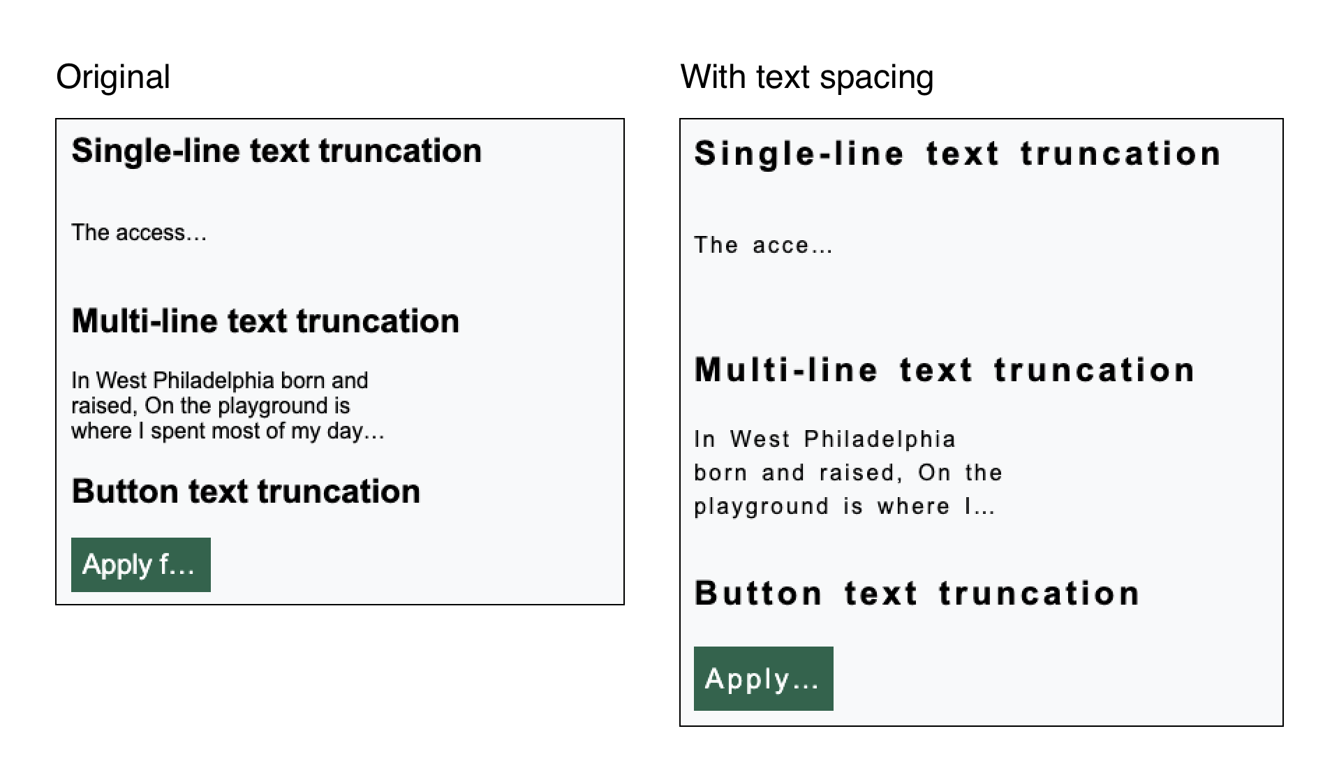
Increased text spacing
Using the 1.4.12 Text Spacing bookmarklet (credit to Steve Faulkner) to apply increased line height, paragraph, letter and word spacing that WCAG 1.4.12 Text Spacing (Level AA) requires support of, we can see a similar effect with additional text being cut off.
Increased font size and text spacing
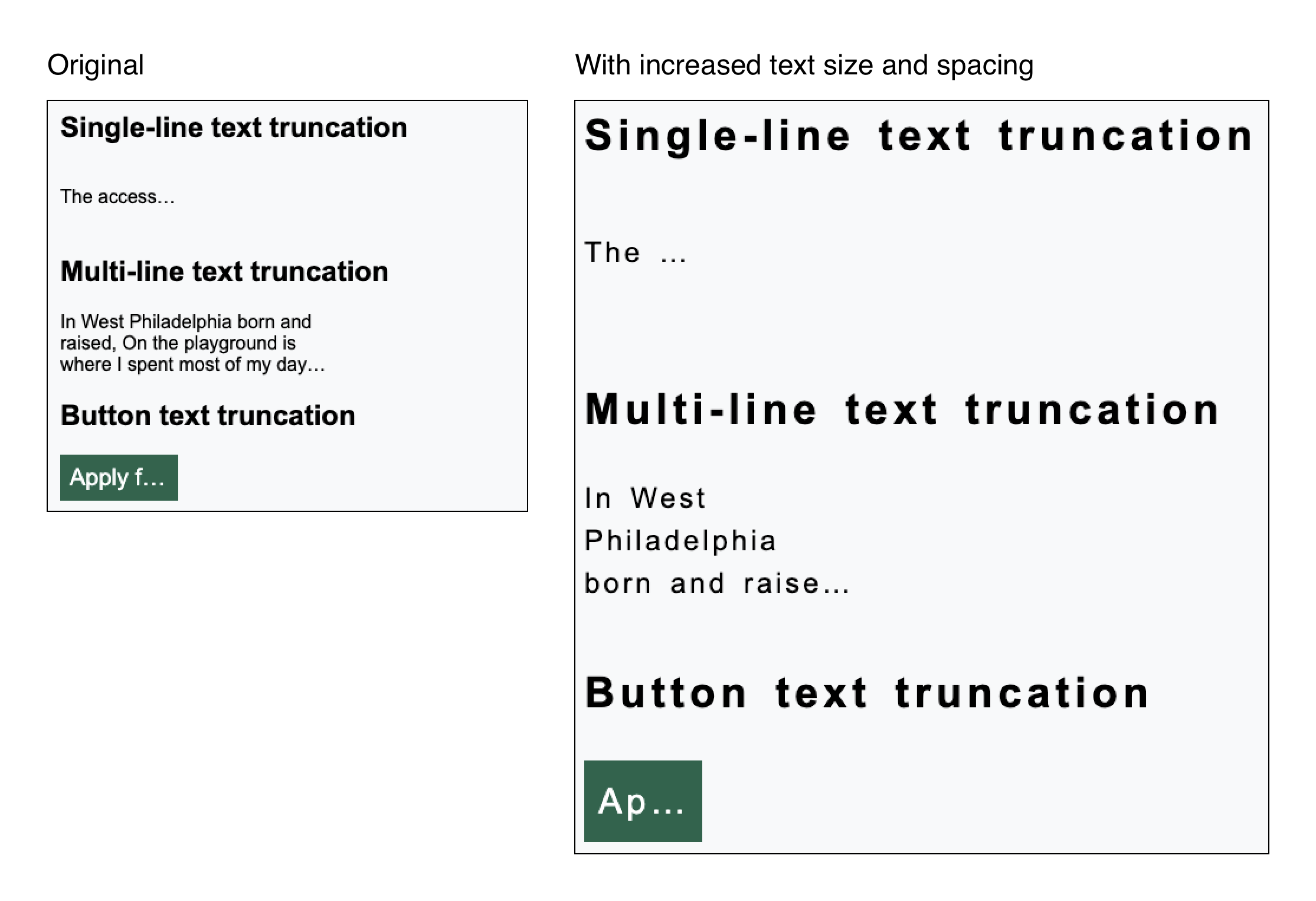
Combining both an increased font size and increased text spacing makes matters even worse to the point where meaning is completely lost.
Browser zoom
Some sites apply truncation only at smaller screen widths using media queries. Browser zoom effectively reduces the viewport width, which can trigger the same truncation.
This means users who zoom in may lose content even on large screens.
Here's an example of truncation applied via CSS media queries targetting smaller screen widths (also triggered by higher levels of browser zoom on larger screens):
Effects on screen readers
At the time of testing, JAWS, NVDA and macOS VoiceOver read the full untruncated text without any effect. This is because the CSS method for truncating text is a purely visual effect, the text is still in the DOM and not hidden from the accessibility tree.
Truncated single and multiple line text screen reader output
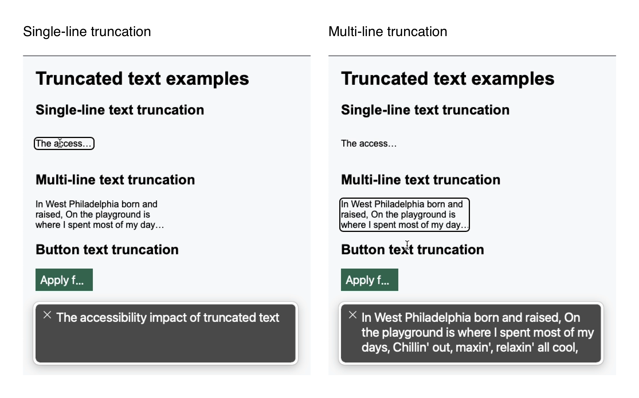
Truncated button text screen reader output
Effects on voice control and speech recognition
Speech recognition and voice control software, such as Dragon, allows people to browse the web and interact with controls using spoken commands. These tools rely heavily on visible text labels. For example, saying "click save" activates a button with the visible text "Save".
When text is truncated, visible labels become shorter or unclear. This makes controls harder or impossible to activate by voice and forces users to rely on slower workarounds.
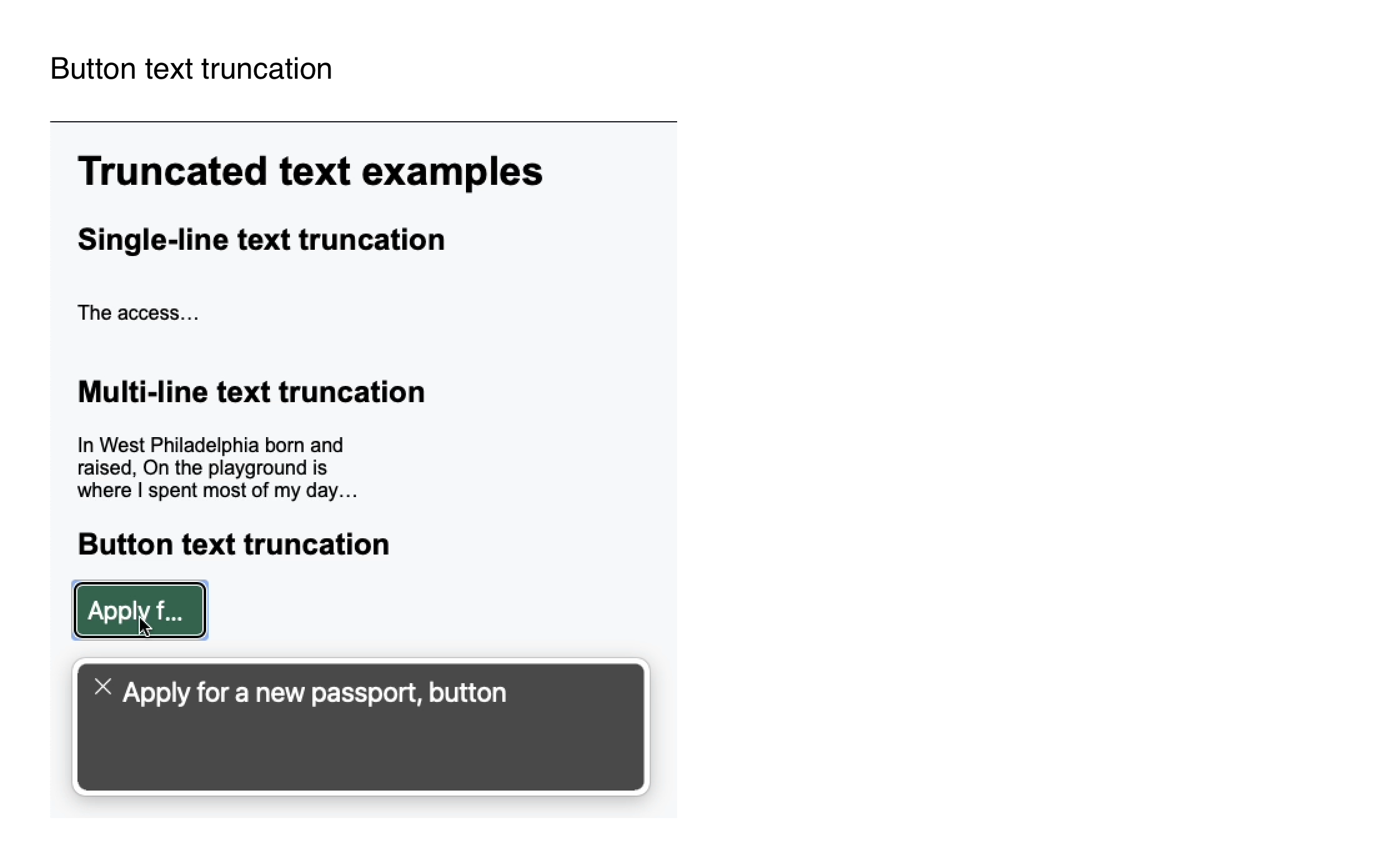
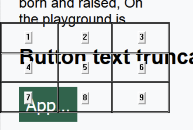
The impact depends on how much the text is truncated. Using the button in the CodePen as an example:
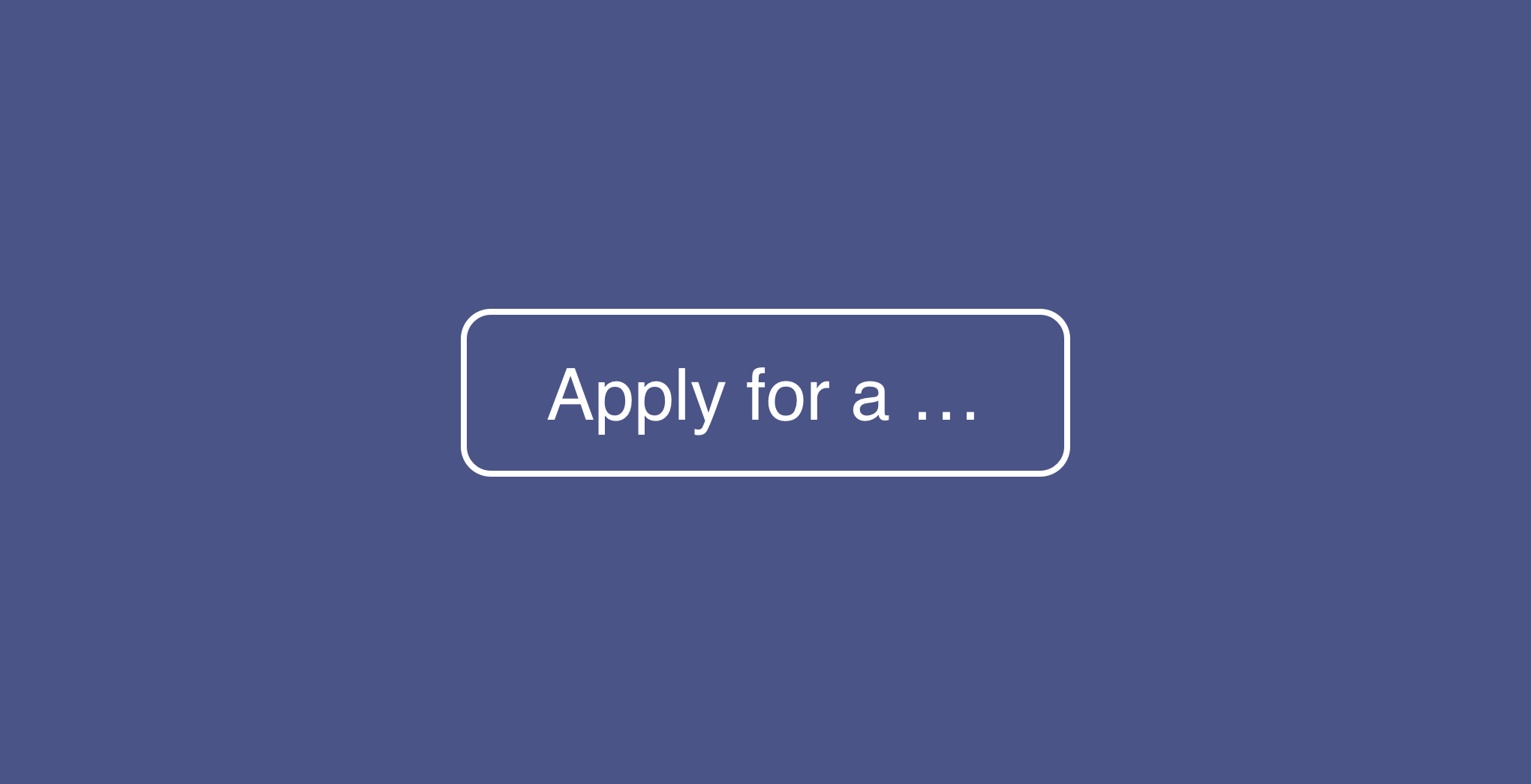
- The full button text (and accessible name) is "Apply for a new passport"
- When truncated to "Apply f...", the button can still be activated by saying "click apply", though additional steps will be required if multiple "apply" buttons exist
- When further truncated to "App...", saying "click app" no longer works
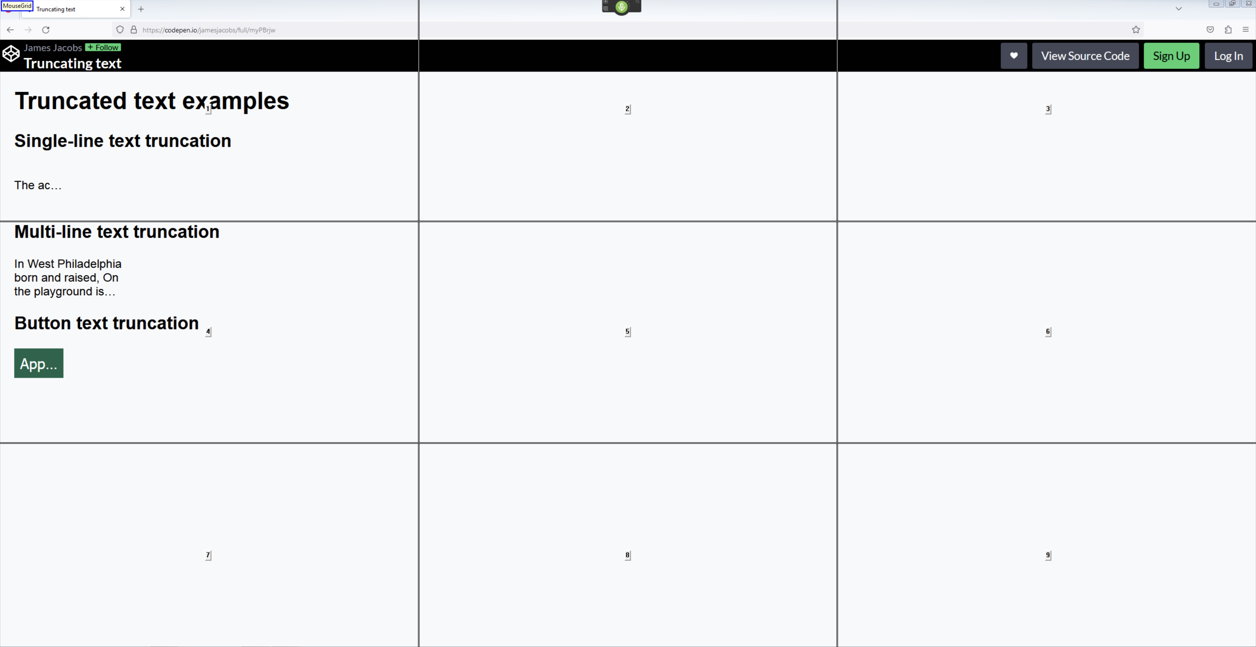
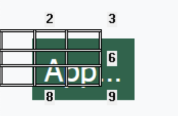
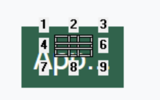
Once visible text is reduced to partial or indistinguishable words, users must switch to alternative interaction methods. One common workaround is the mousegrid, which overlays a numbered grid on the page and requires users to narrow down the target area step by step before activating the control.
In the CodePen example, activating the button this way takes five separate steps before the user can say "mouse click". This adds significant time, effort, and frustration compared to using clear, untruncated labels.
Mousegrid step 1
Mousegrid step 2

Mousegrid step 3
Mousegrid step 4
Mousegrid step 5
WCAG considerations
Depending on the situation and how truncation is used, it may lead to failures of several WCAG success criteria:
- 1.3.1 Info and Relationships (A): potentially a failure as the truncation is only visually and not programatically conveyed
- 1.4.4 Resize Text (AA): if text cannot be resized up to 200% without loss of content (see F69)
- 1.4.10 Reflow (AA): if truncation occurs as a result of reflow at smaller viewport widths, such as 320 CSS pixels wide or 1280px with 400% zoom, and no alternative way to access the full content is provided
- 1.4.12 Text Spacing (AA): if support for the required spacing causes any lose of content (unless an accessible alternative is provided)
- 2.5.3 Label in Name (A): if truncated visible labels do not match or are not contained within the components accessible name. For example: "Apply for a new passport" does not contain the text "Apply..."
- 3.3.2 Labels or Instructions (A): if form labels or instruction are truncated to the point where they lose meaning
What to do instead
Avoid truncating text wherever possible. Truncation adds barriers and often causes confusion for everyone.
In most cases, truncation can be designed away by:
- Letting text wrap naturally
- Using flexible layouts instead of fixed widths
- Allowing containers to grow with content
- Rethinking whether all content needs to fit in one line
If content needs to be hidden, use clear and accessible patterns such as the Disclosure pattern, that work with keyboard, touch, and screen readers.
When dealing with long unbroken strings/words, where you may not have control over the content (e.g., user generated content or content pulled in from 3rd party integrations), rather than trucating, hyphenate the word and allow it to wrap:
.wrap-text-with-hyphens {
  overflow-wrap: break-word;
  hyphens: auto;
}
In rare cases where truncation is unavoidable, provide an obvious and accessible way to view the full content. This might mean repeating the full text nearby or offering a clear accessible control to reveal it.
Truncation is a design choice, not a technical limit. By prioritising clarity over rigid layouts, we can create interfaces that work better for everyone.